
Overview
As lead designer, my priorities included creating a brand new experience for individuals whether they are looking to learn more about Habitat, get involved with its mission, or purchase a home.
As lead designer, my priorities included creating a brand new experience for individuals whether they are looking to learn more about Habitat, get involved with its mission, or purchase a home.
The Problem
There is not a clear hierarchy and the navigation seems to be sporadic. Users cannot navigate easily and find exactly what it is they are looking for.
Without a clean navigation and concise sitemap, HabitatNYC is not able to retain enough visitors to garner support and volunteers for its initiatives.

User Research & Competitive Analysis
Conducted research with stakeholders and people off of the street to get additional insights.
My research encompassed -
My research encompassed -
• Understating what its audience understands about HabitatNYC
• How does each component of Habitat feed into the overall mission
• How current users navigate the website
• How can we help reintroduce Habitat to its audience
• How does each component of Habitat feed into the overall mission
• How current users navigate the website
• How can we help reintroduce Habitat to its audience
With a couple of promising ideas, we wanted to weight them out against some of the other popular charity organizations. Throughout this process we were constantly ideating on how to simplify and create a new experience unique to Habitat.
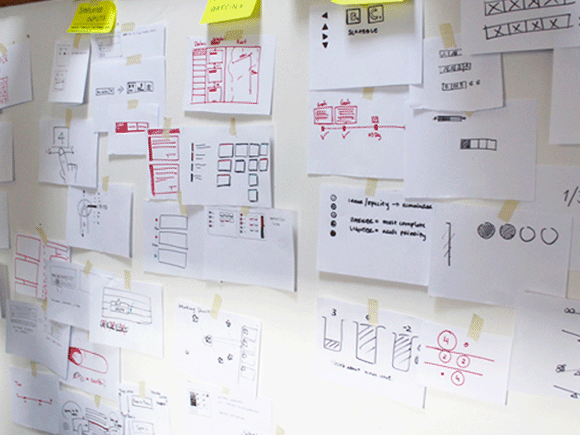
White Boarding & Wireframing
As with most complex digital projects it helps to generate ideas on paper or a whiteboard. This helps in brainstorming various concepts, layout and simple interactions without having to worry about using a a computer or software. We want this phase to be agile and efficient. Find good ideas and expand on them while discarding the impractical ones. Answering questions and deciding on approaches such as “tabbed” or “single scroll” was decided here.
With a good sense of a couple of promising ideas, we wanted to weight them out against some of the other popular charity organizations. From here we were able to get a clearer sense of the different patterns and flows and narrow down the best practices in a charity organizations user experience. Throughout this process we were constantly ideating on how to simplify and create a new experience unique to Habitat.
Navigation
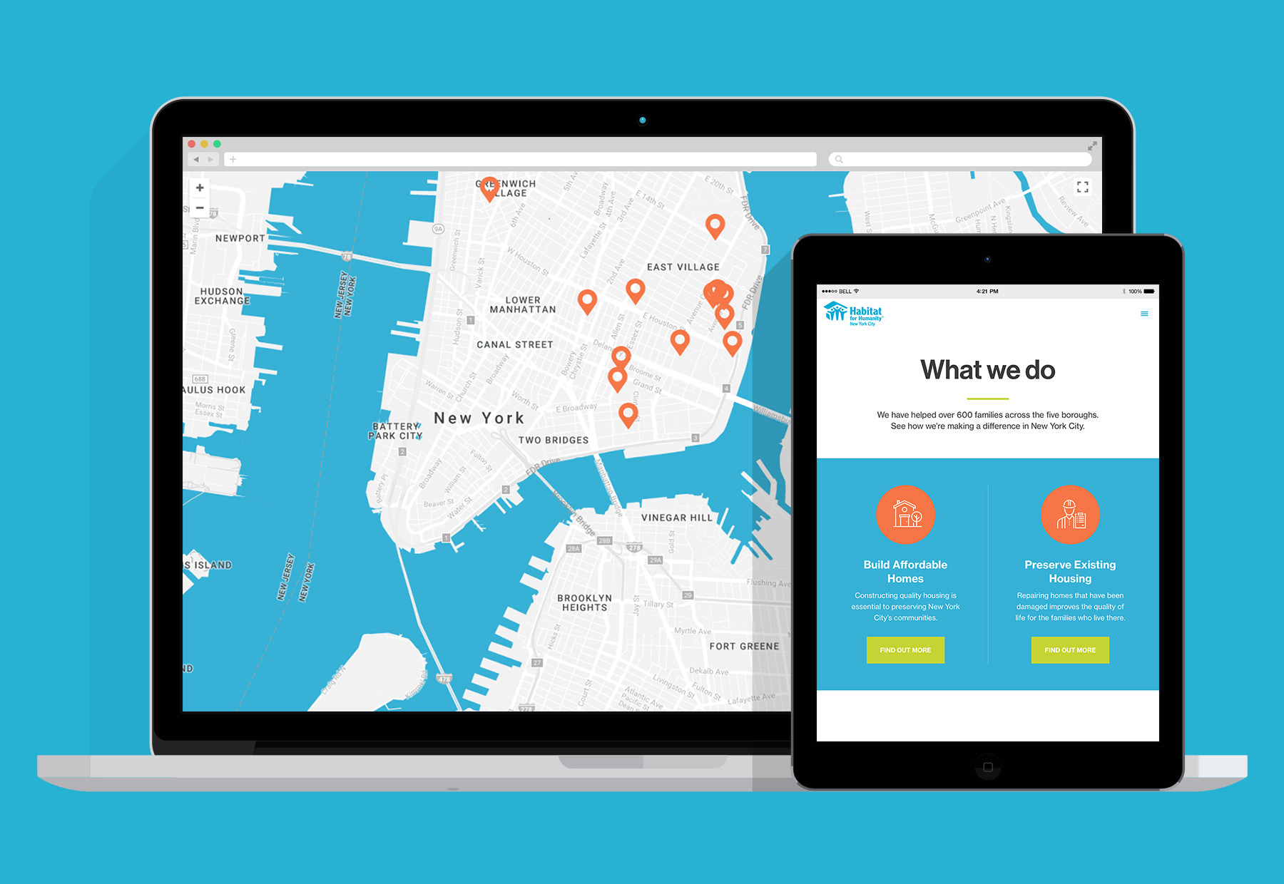
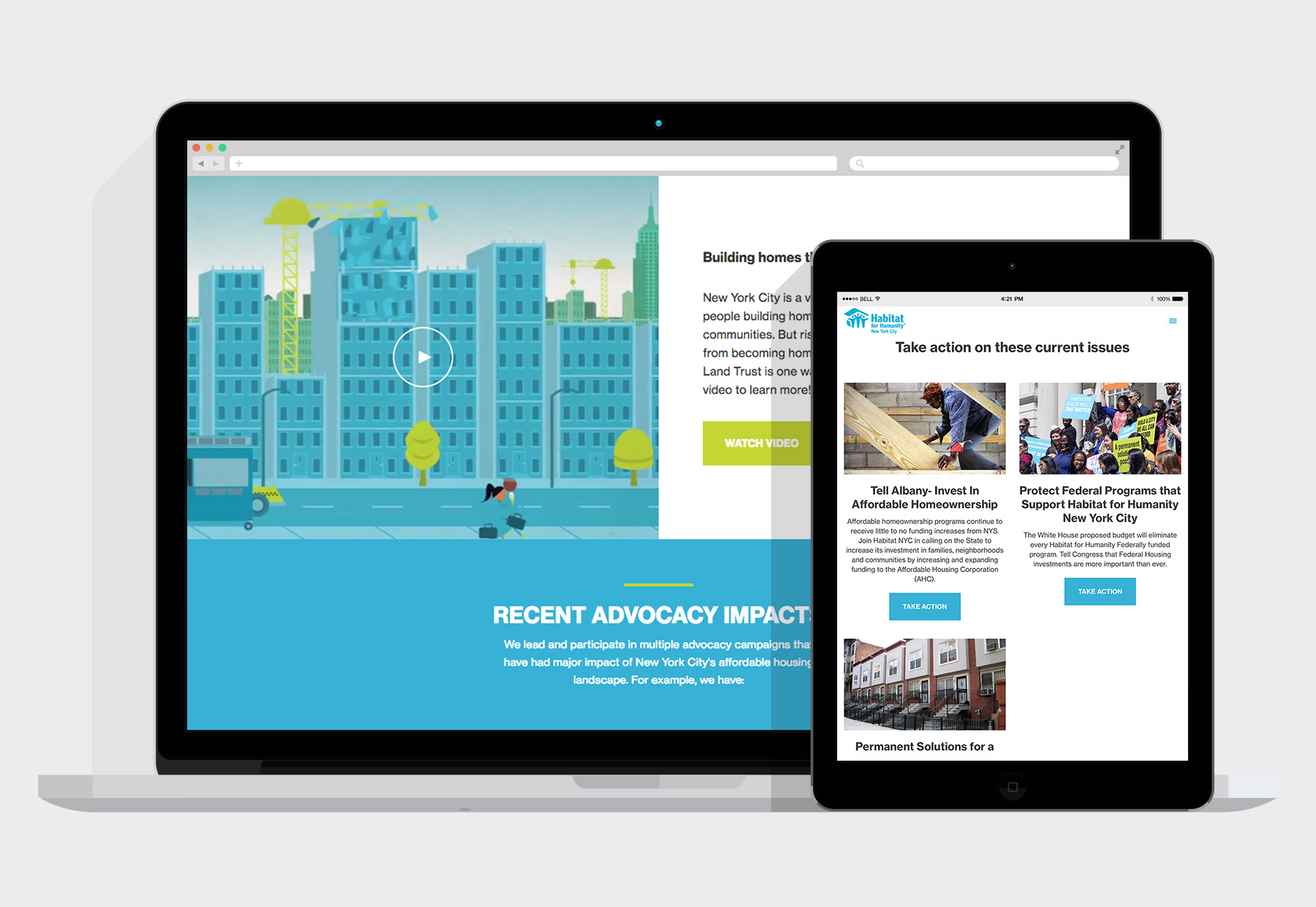
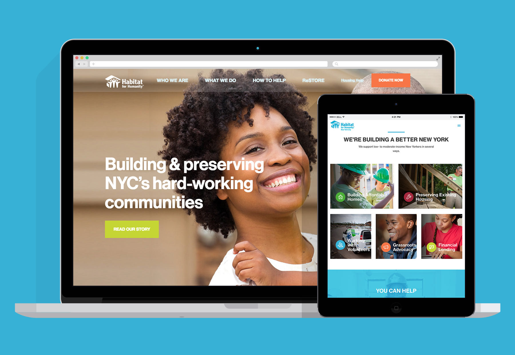
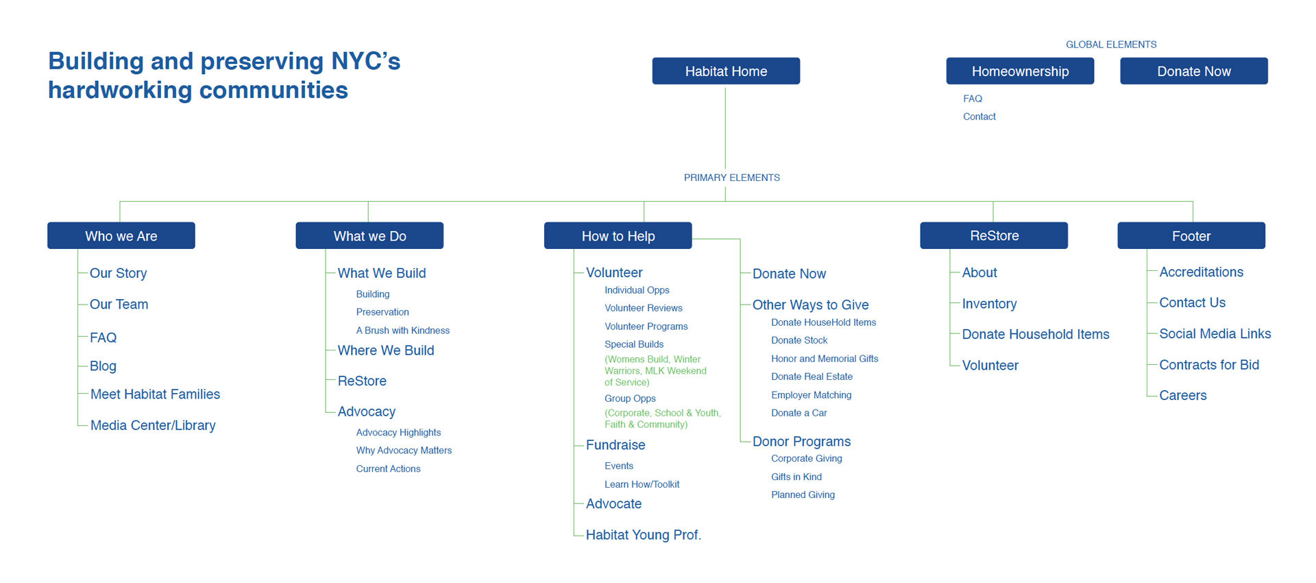
The first goal was to clean up the current navigation thoroughly with a brand new sitemap. Habitat’s current navigation faced challenges due to the fact that it was severely cluttered and there was no sense of hierarchy. Our approach was to simplify the navigation as much as possible by creating bucket list categories where alot of the current nav items could live in. This made navigating the site alot easier to users depending on what type of experience they were looking for.
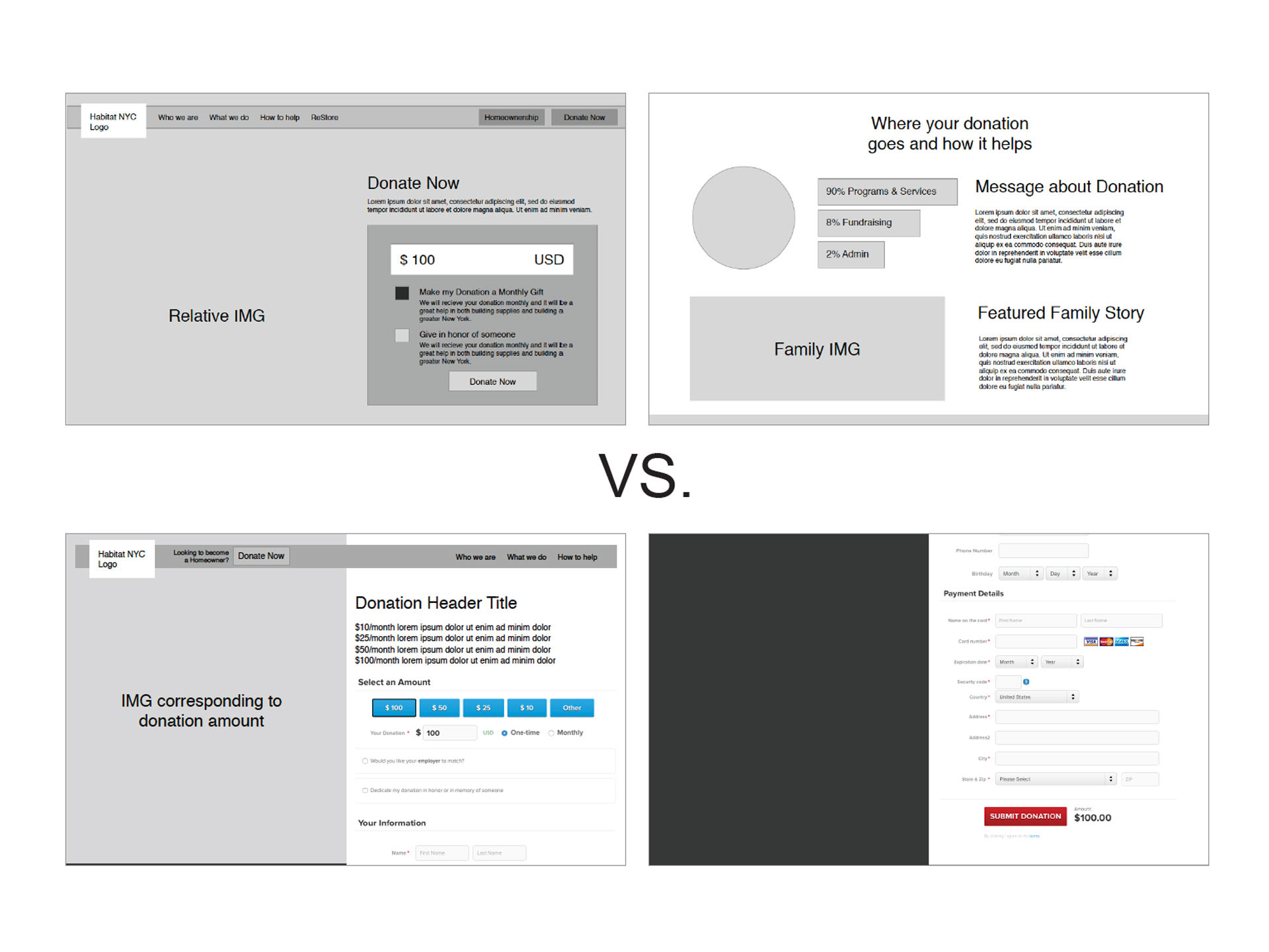
Validating: A/B Testing
Typically when shopping online, we’re met with the sign-up or log-in form as we try to check out. This causes unnecessary friction in the purchase process and may cost donation revenue.
We decided to test a different approach. I comped up a design that lets users check out without the sign-up, moving the extra step of creating an account to the end of the process, after the check out. Removing a barrier increased completed donations overall.
Visual Design
After countless iterations of wireframes and prototypes it was time to bring the design to life through visual mockups. The goal is create a visual representation of what the final product will look like. Some ideas in the UX phase just did not work out in the visual phase and had to go back to the drawing board. Keeping true to the wireframes and defined interactions was important. We were able to be get more valuable feedback once Habitat stakeholders saw how the design was actually going to look.
After countless iterations of wireframes and prototypes it was time to bring the design to life through visual mockups. The goal is create a visual representation of what the final product will look like. Some ideas in the UX phase just did not work out in the visual phase and had to go back to the drawing board. Keeping true to the wireframes and defined interactions was important. We were able to be get more valuable feedback once Habitat stakeholders saw how the design was actually going to look.